EIDOLON WHISKY
CREATING A MODERN BRAND STORY, FIT FOR LEGACY
SERVICES →
Brand guidelines,
Brand identity,
Brand strategy,
Packaging design,
When the Port Ellen distillery closed in 1983, the Laing brothers’ grandfather laid down some of their final casks.
In December 2020 Hunter Laing chose to commemorate their grandfather – and the original distillery – with a limited release of this, his favourite whisky.
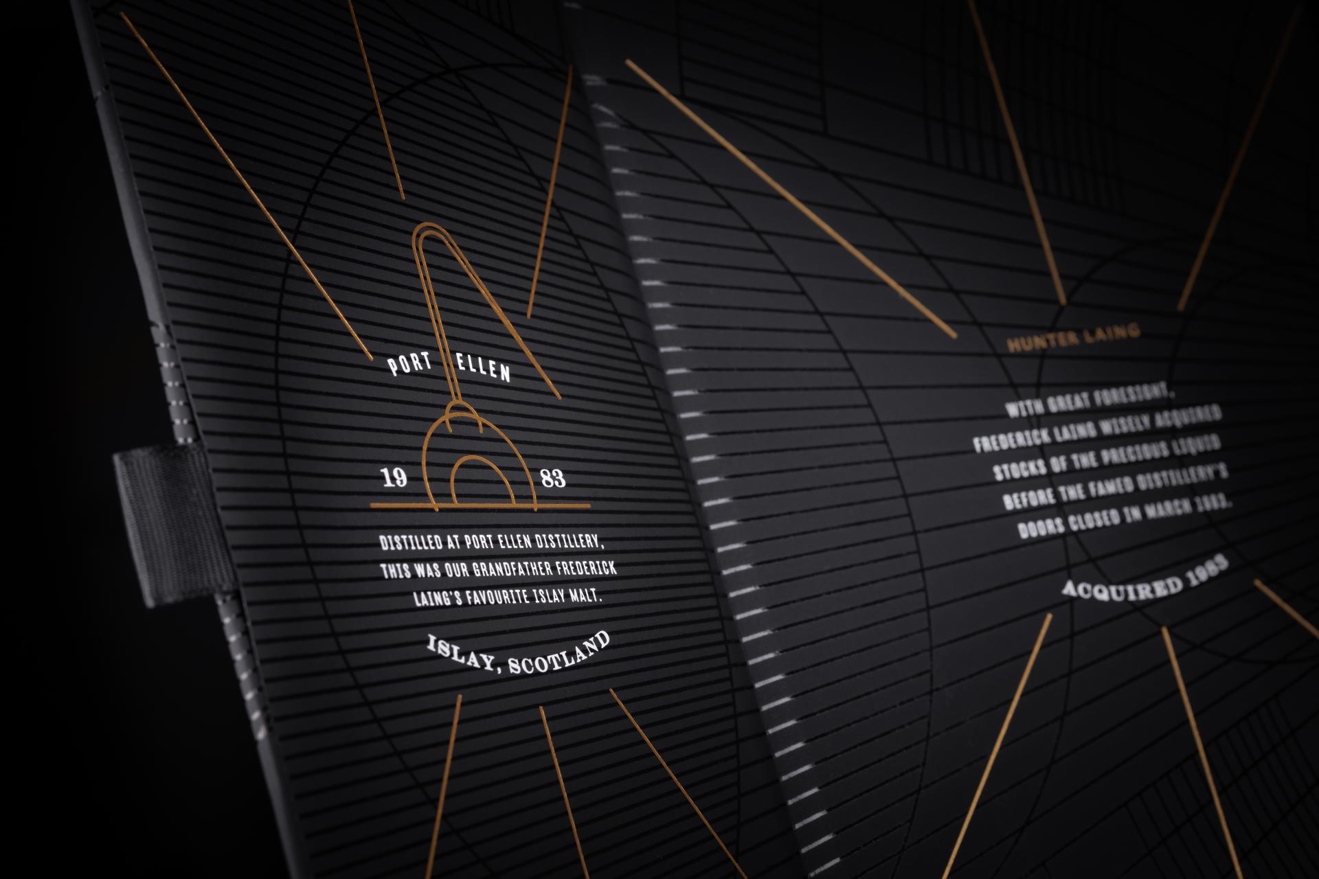
Hunter Laing asked us to tell the brand story and create a luxury packaging experience that is worthy of the family history, Port Ellen distillery, and the liquid’s rarity.
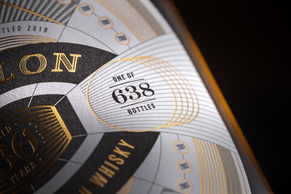
EIDOLON IS THE FIRST IN A COLLECTION OF THREE RELEASES.

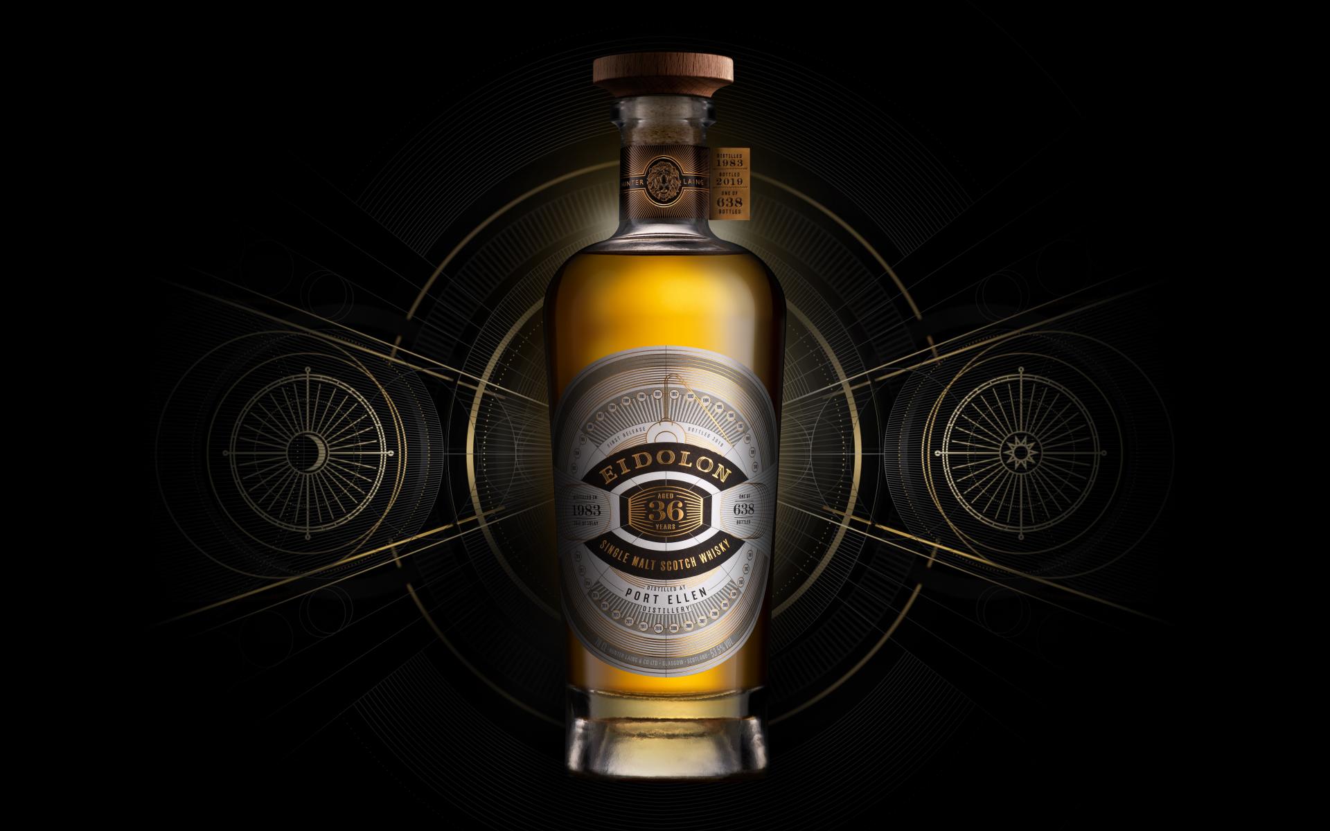
The name Eidolon has a dual meaning. An idealised person or object, and ghosts or spectres. The latter references the ghost distillery of Port Ellen and the former, its history and esteemed reputation within the whisky industry.

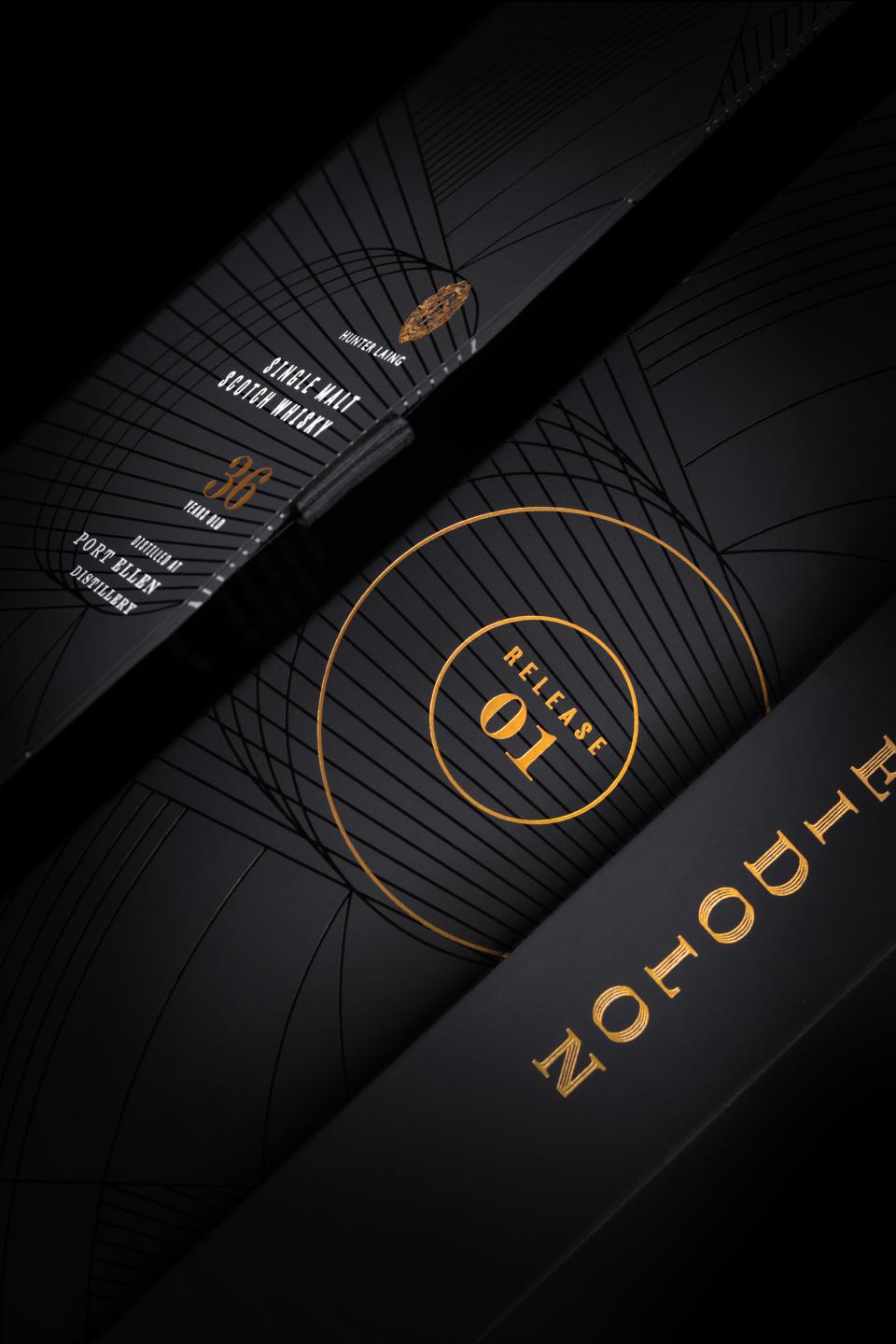

Eidolon’s packaging is unusually modern for the mature single malt market. The ‘sacred geometry’ aesthetic highlights the passing of time and the patience involved in waiting for the whisky to finally be ready to share. The design is intricately embossed on a foiled label and elegantly finished with a bespoke box.
SAN FRANCISCO WORLD SPIRITS AWARDS DOUBLE GOLD
EIDOLON IS A FITTING CONCLUSION TO THE ERA OF THE OLD PORT ELLEN DISTILLERY, AND A FITTING TRIBUTE TO A BELOVED FAMILY MEMBER.