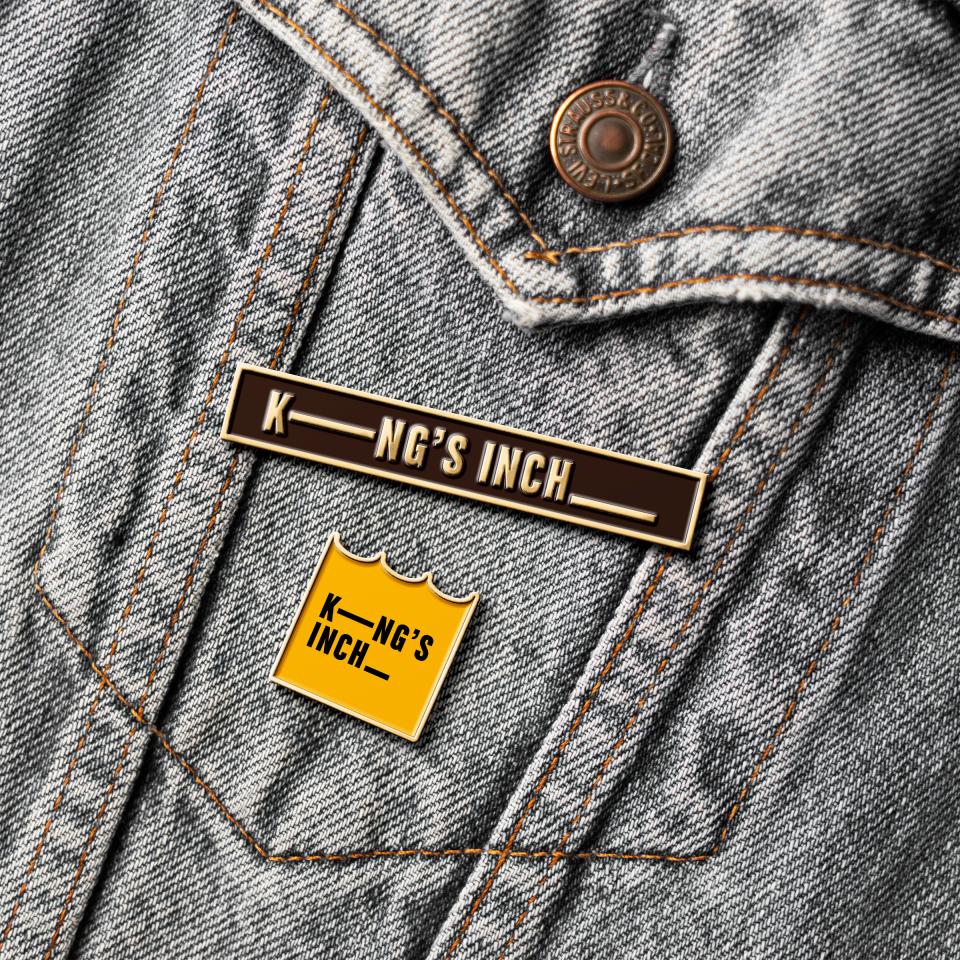
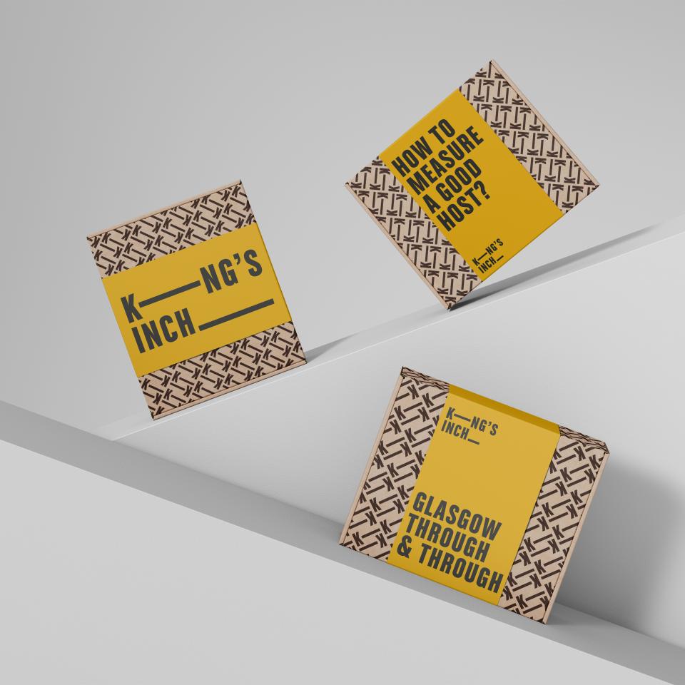
KING'S INCH
GLASGOW THROUGH AND THROUGH
When Glasgow-based Courageous Spirits came to talk to us about their first Single Malt Whisky, their biggest headache was how to position the brand — a problem we were more than happy to solve for them.
Glasgow is famous for its people, their generous hospitality and their great sense of humour. And this is how we define the King’s Inch brand.
The name King’s Inch had been floated with the idea of telling the story of a lost island in the Clyde, but that didn’t have the right character for this whisky.
We focused instead on the fact that the term came from an ancient measure based on barley. This was to be our springboard.
FINDING SWAGGER IN A MEDIEVAL MEASURE
Courageous already had a very successful gin with a very urban personality. This whisky was intended for the same outlets, but they couldn’t really see how to relate a Single Malt Whisky to that audience.
They were used to stories of single malts distilled at the foot of a Ben, not in the heart of a city. And this whisky had to be able to stand apart from the gin – but still feel like it belonged in their portfolio.
As we worked with the team, examining the name, researching the local history, debating the audience, we had a lot of fun – and a lot of Glasgow banter came to the fore. We debated over the height of an actual ‘dram’ and exchanged funny family tales of generous hosts and the scorn aimed at the not so generous hosts.
And in that, we came up with the answer. Throw away the ‘Scotland’ rule book and celebrate with Glasgow pride.
We had found a way to turn the reference to a measure into a personality. Now it would refer to ‘the measure of a good host’.
This brought the name and the story up to date - celebrating Glasgow as it is now, pulling in the pace, style, language, humour and that big confident personality. With this personality, and a bit of Glasgow swagger in mind, we had direction for the pack design.
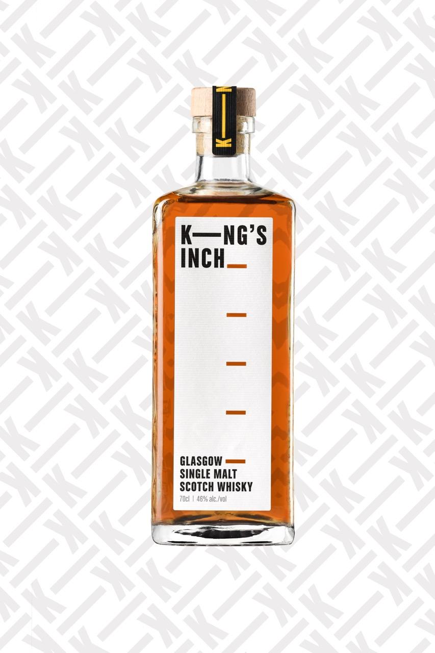
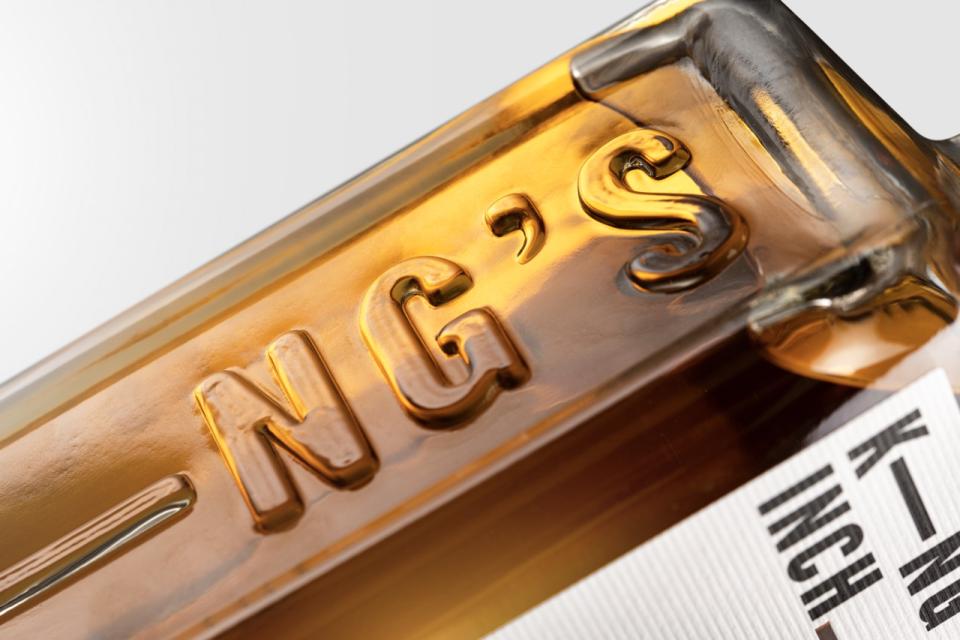
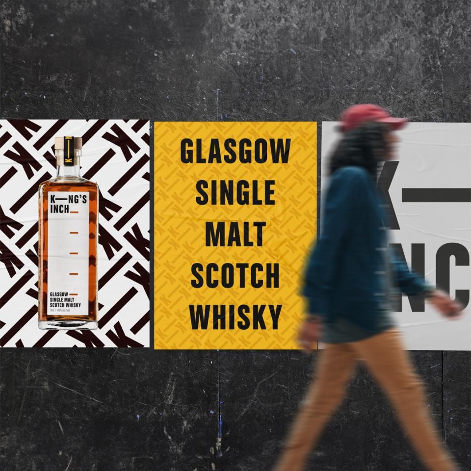
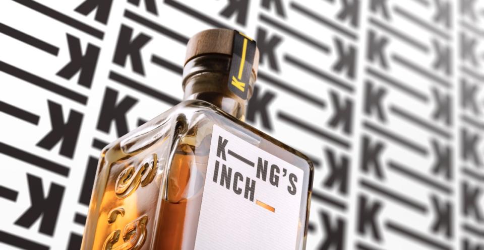
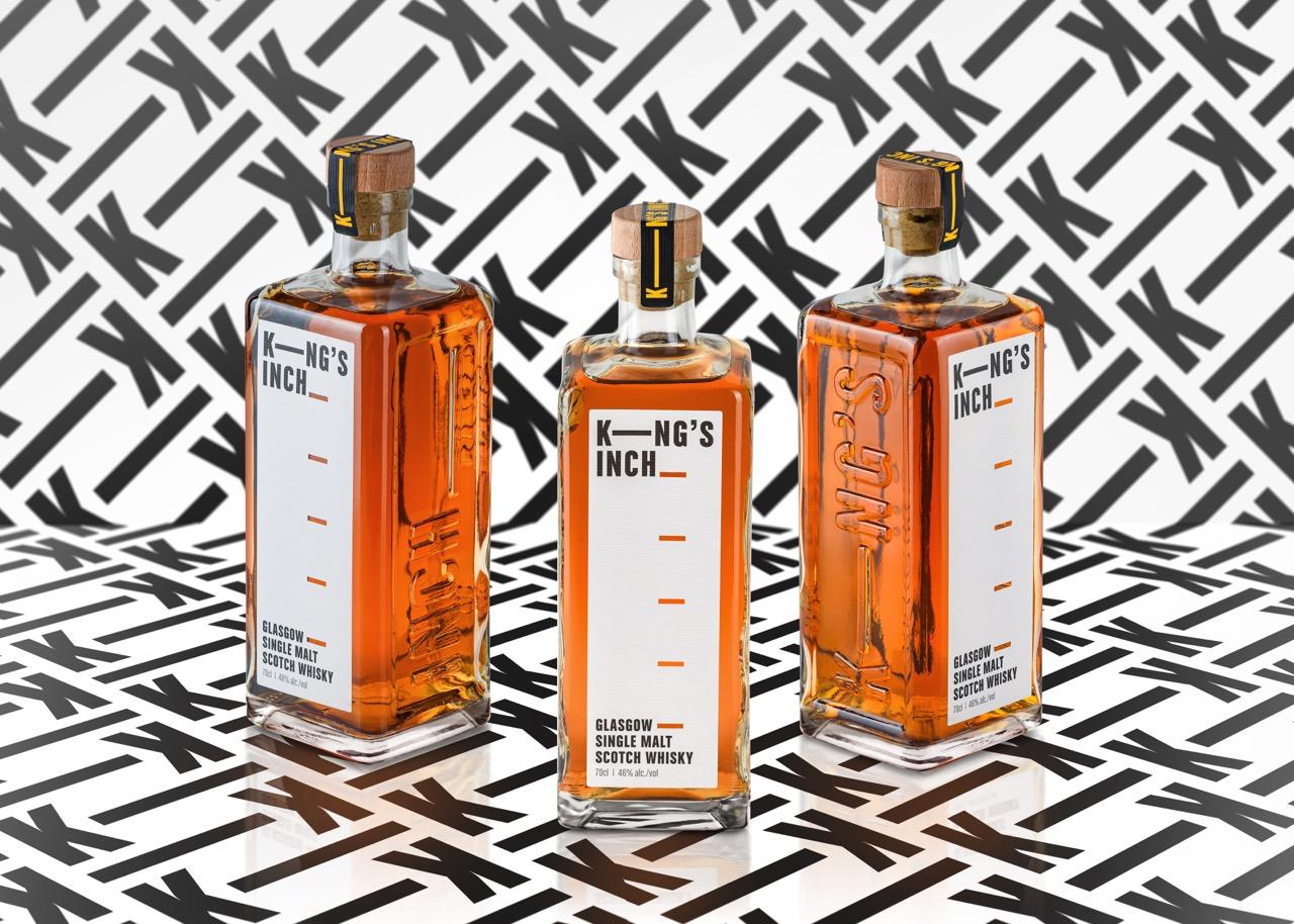
We wanted the bottle itself to carry the conversation for us. We imagined the gregarious host, proudly pouring a measure of King’s Inch, their guest giving them a hard time if being a bit on the cautious side of a pour. And with a prompt to tell our story literally at their fingertips.
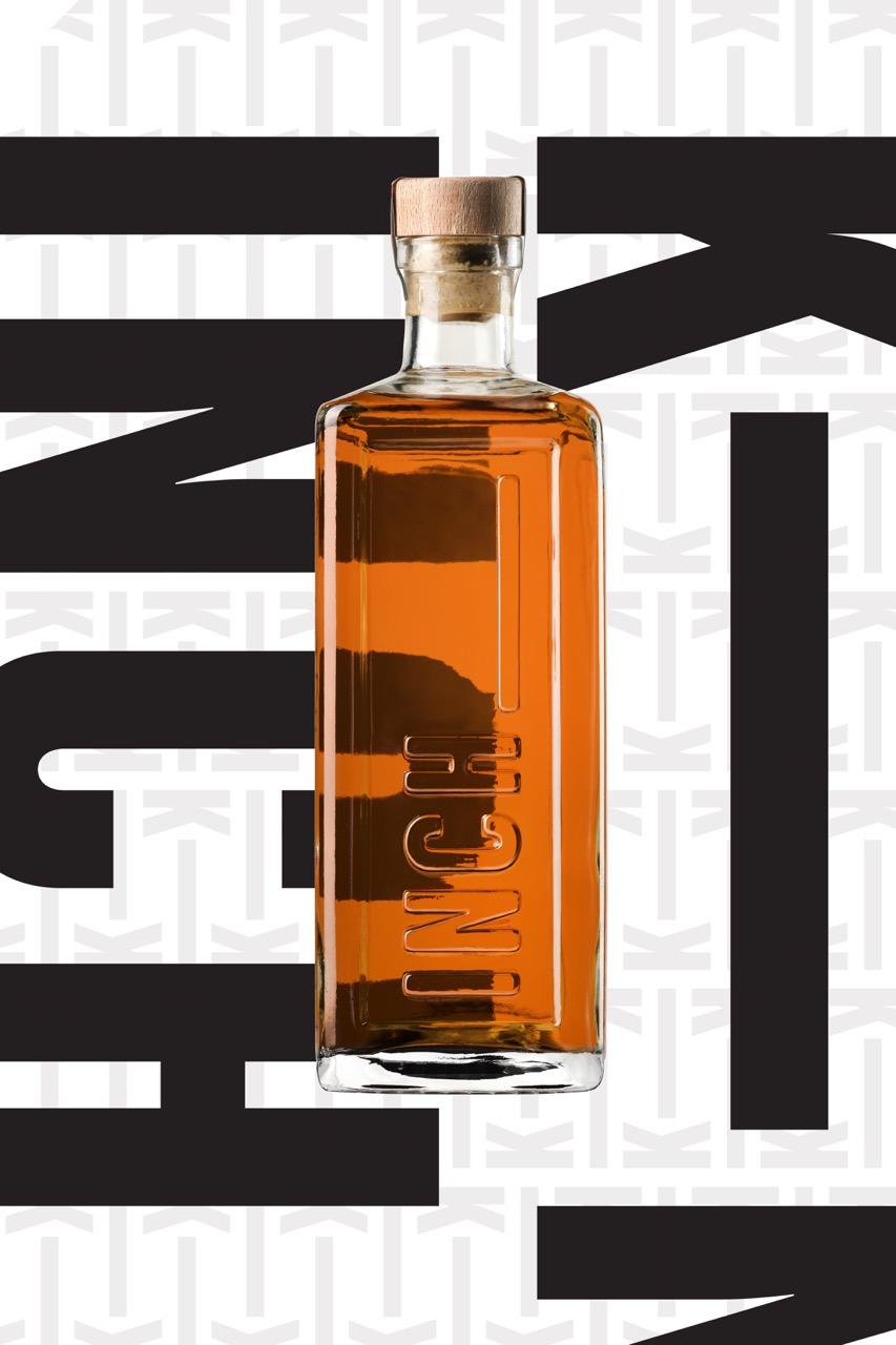
The bespoke bottle has been specifically developed literally inch by inch. The 5 cutouts, each spaced one inch apart running up the height of the bottle, are an intentional message to encourage some ‘measure’ banter. To cap it off, even the bottle stopper seal is designed to units of an inch.
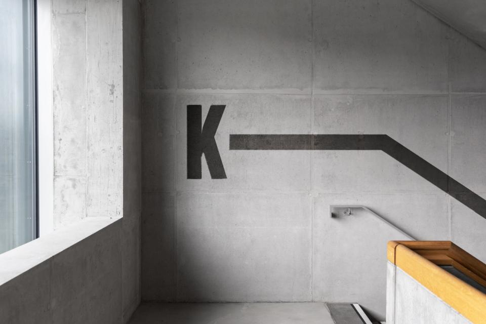
As King’s Inch is an urban whisky made in a working city, the brand and the bottle reflect the city’s roots in heavy industry and its forefront in the world of design with its robust yet modern city-chic charm.