LOCHLEA WHISKY
A GRAIN TO GLASS STORY
What do you do when you have 50 acres of barley? The golden answer is whisky.
Lochlea has always farmed barley, mostly for livestock feed and less for human consumption. But they wanted to switch things up. Our task? To tell their story and journey from grain to glass, through brand and packaging.
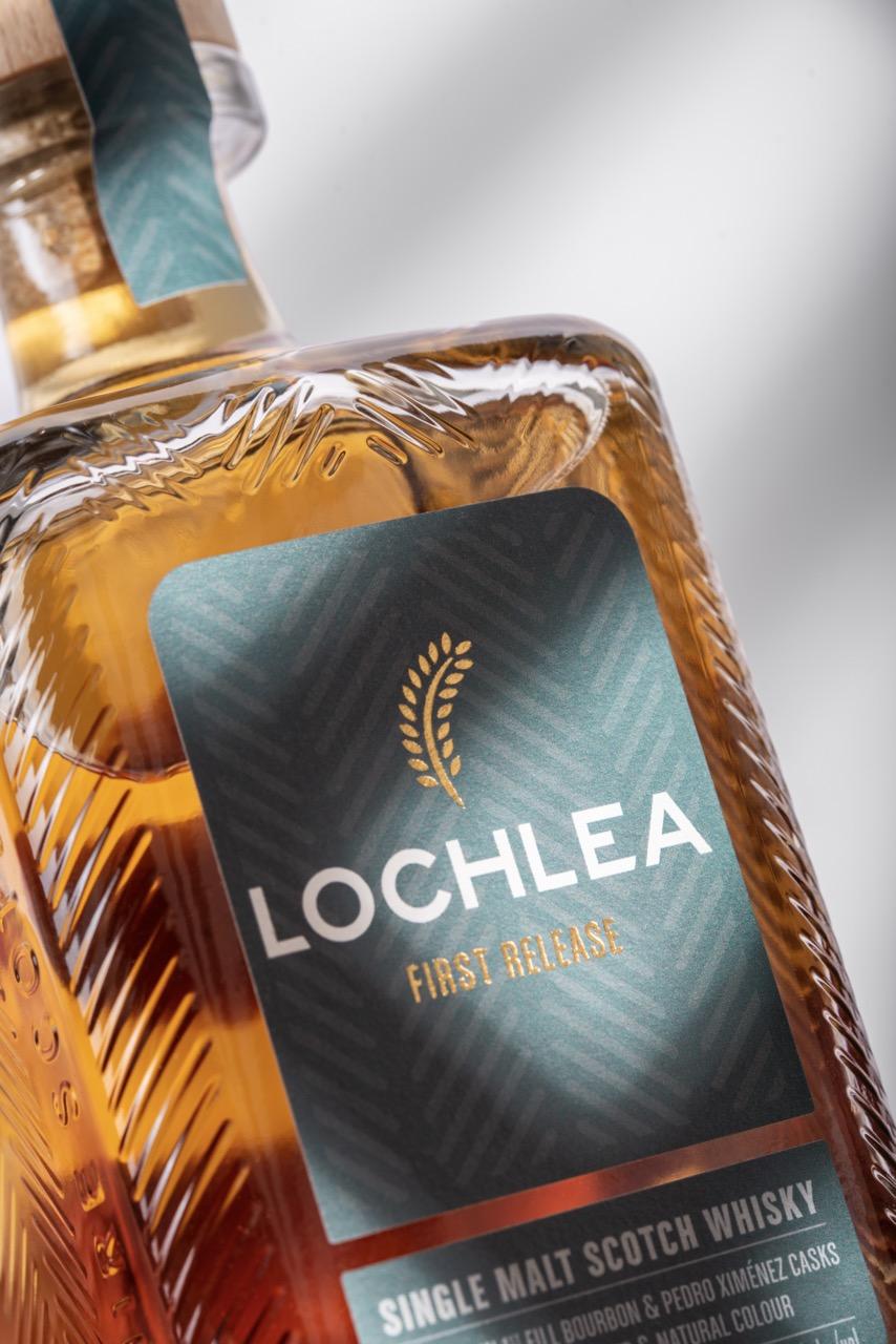
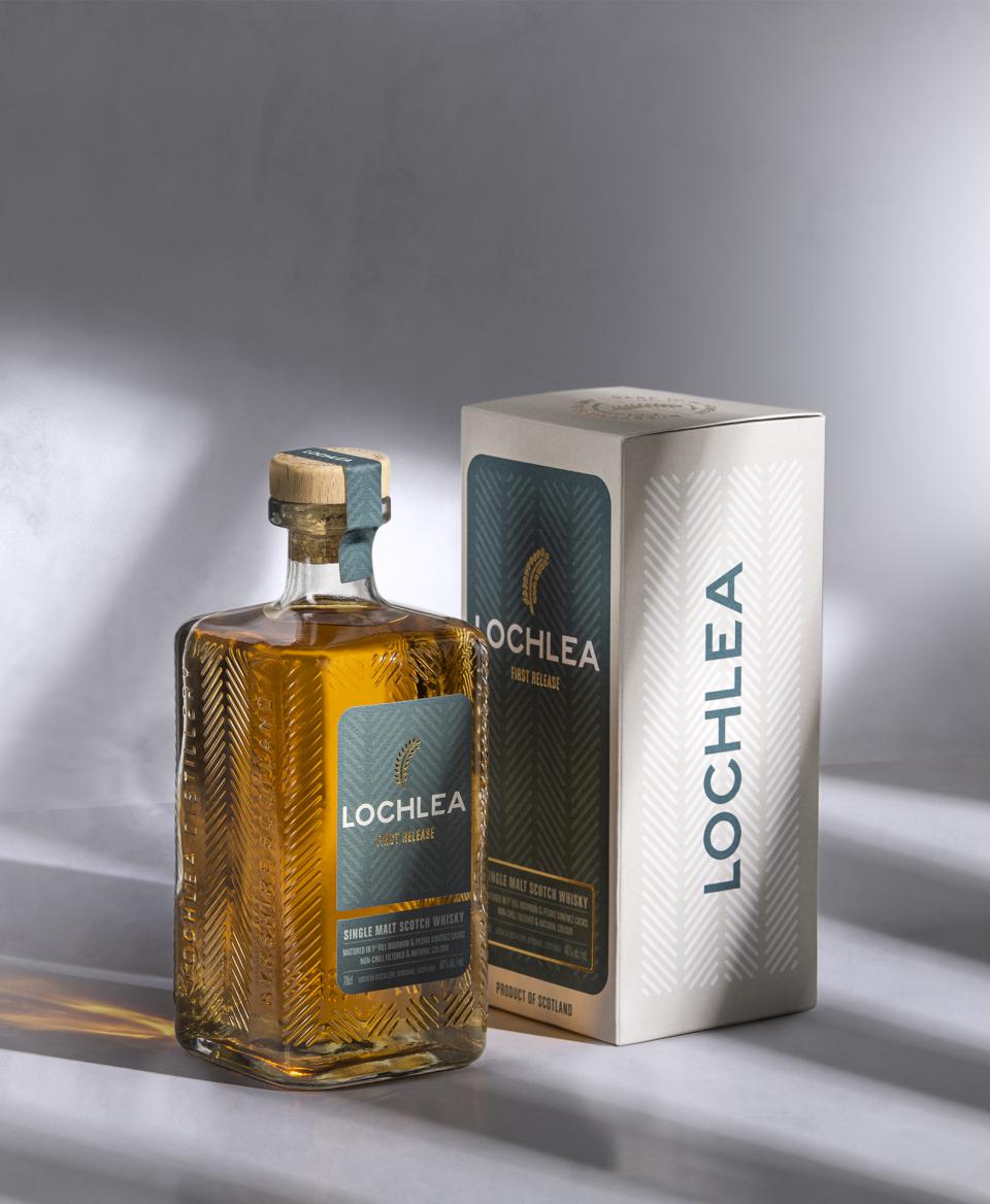
The farm itself inspired the Lochlea brand. The farm has such a fascinating story so we wanted to spotlight the liquid provenance. At first glance, the logo is a stalk of barley, but it hints at a writers’ quill — a quiet tribute to Robert Burns, who once resided and farmed the land during his formative years.

ALL ABOUT LOVE, CARE AND ATTENTION
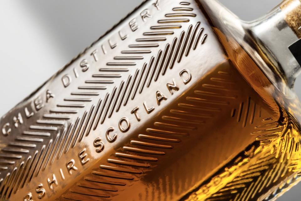
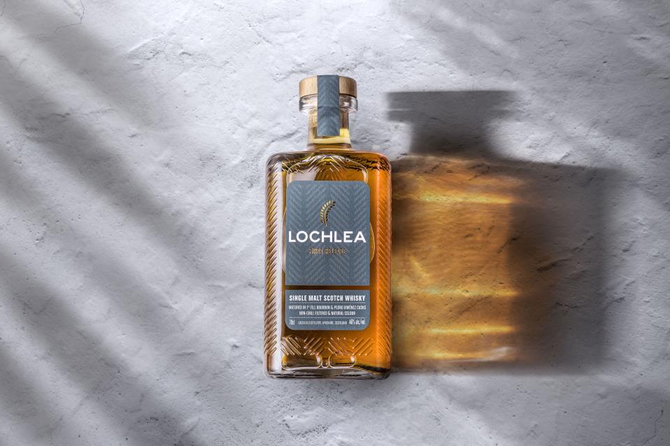
Lochlea takes great pride in its production. Every step in the process, from field to cask, is taken with care. So we channelled this care and detail into the bottle design. An embossed glass bottle inspired by the trails left behind by trucks on the farm, paired with a simple label, reflects the authenticity and modesty of the brand’s Ayrshire home.
The inaugural release of Lochlea was issued on 25 Jan 2022 — which happens to be Robert Burns’ birthday. The first limited release - which was available only from specialist retailers — sold out within hours.