PORT OF LEITH
BUILDING A BRAND FROM THE GROUND UP
ESTABLISHING THE BRAND IDENTITY FOR THE FUTURE DISTILLERY
The marque is reflective of the future and bold thinking behind the distillery. We then built on this to create a visual language.
The brand language had to apply across a portfolio — as ultimately this will be a whisky brand — but more importantly, the execution had to work effectively for different target consumers across the portfolio.
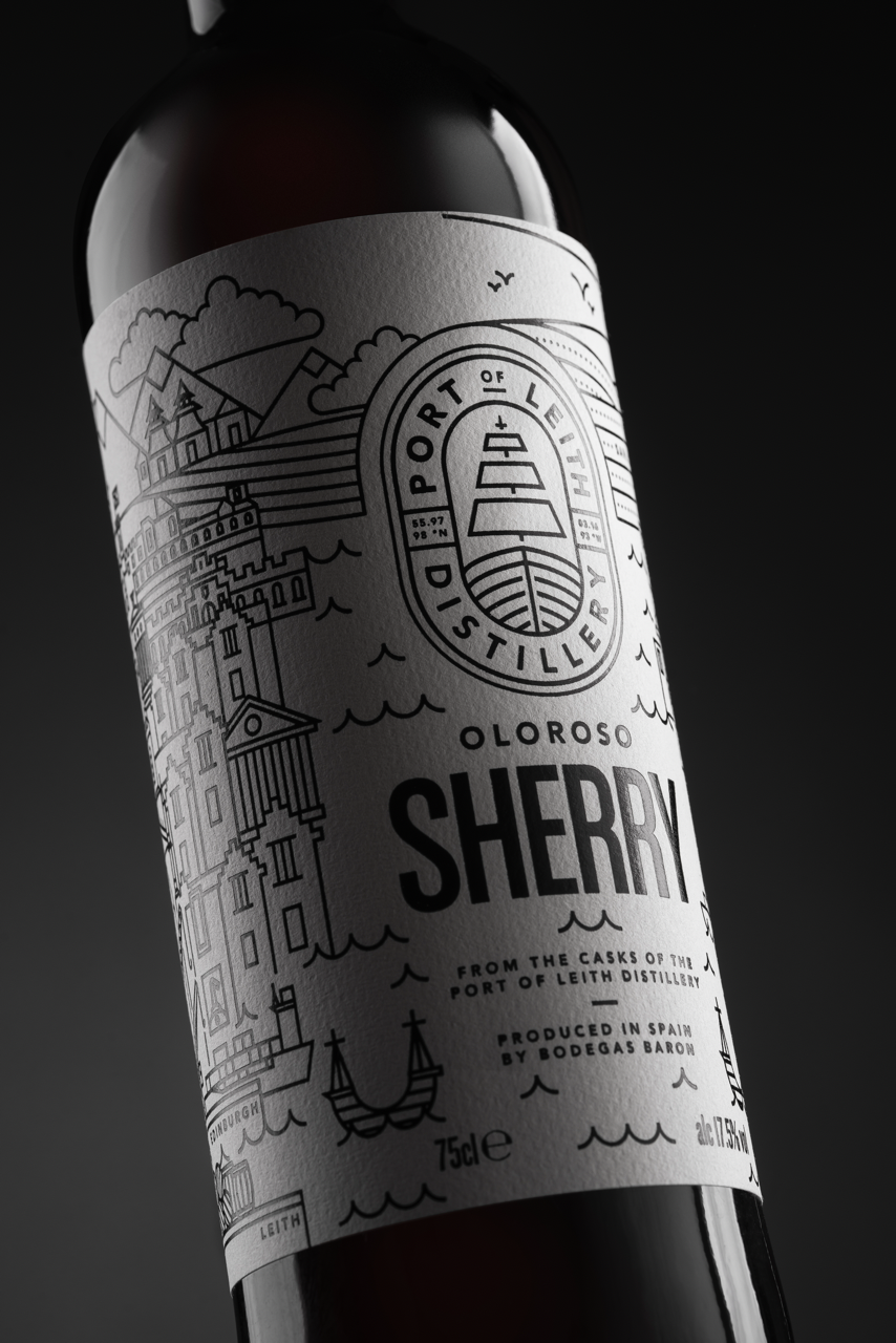
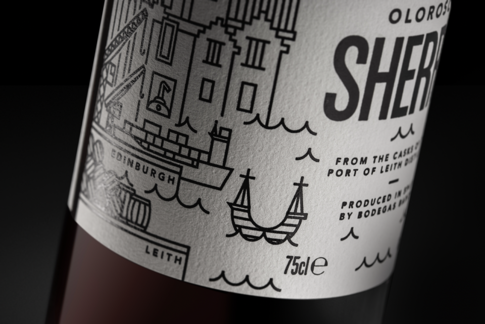
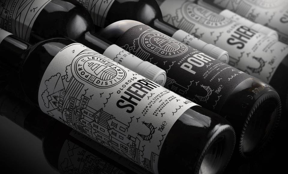
The label on the first product — an Oloroso Sherry — represents two halves of the story behind the product. Leith, the oldest import capital of Scotland, and Jerez, the Spanish heart of Sherry production and exports.
Bringing this story to life visually connected the locations and established the relevance between a future Single Malt producer and their current Sherry product.
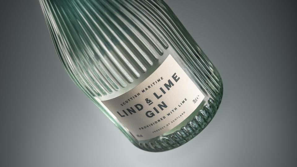
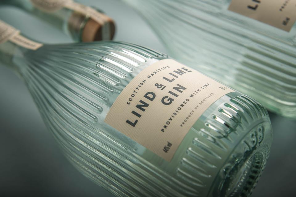
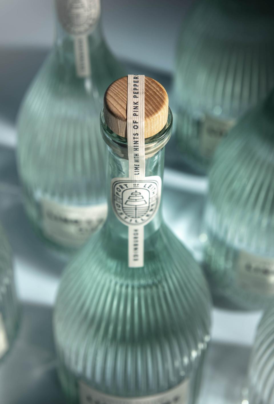
The second product release from the brand, Lind & Lime Gin, demonstrates how the distillery mark and aesthetic of clean, repeat lines provides a recognisable brand aesthetic while delivering a completely different design execution from Sherry for the Gin.
The strong environment brand values of Port of Leith Distillery are further amplified in the glass, design for Lind & Lime, a clever use of the brand toolkit beyond visual identity assets.
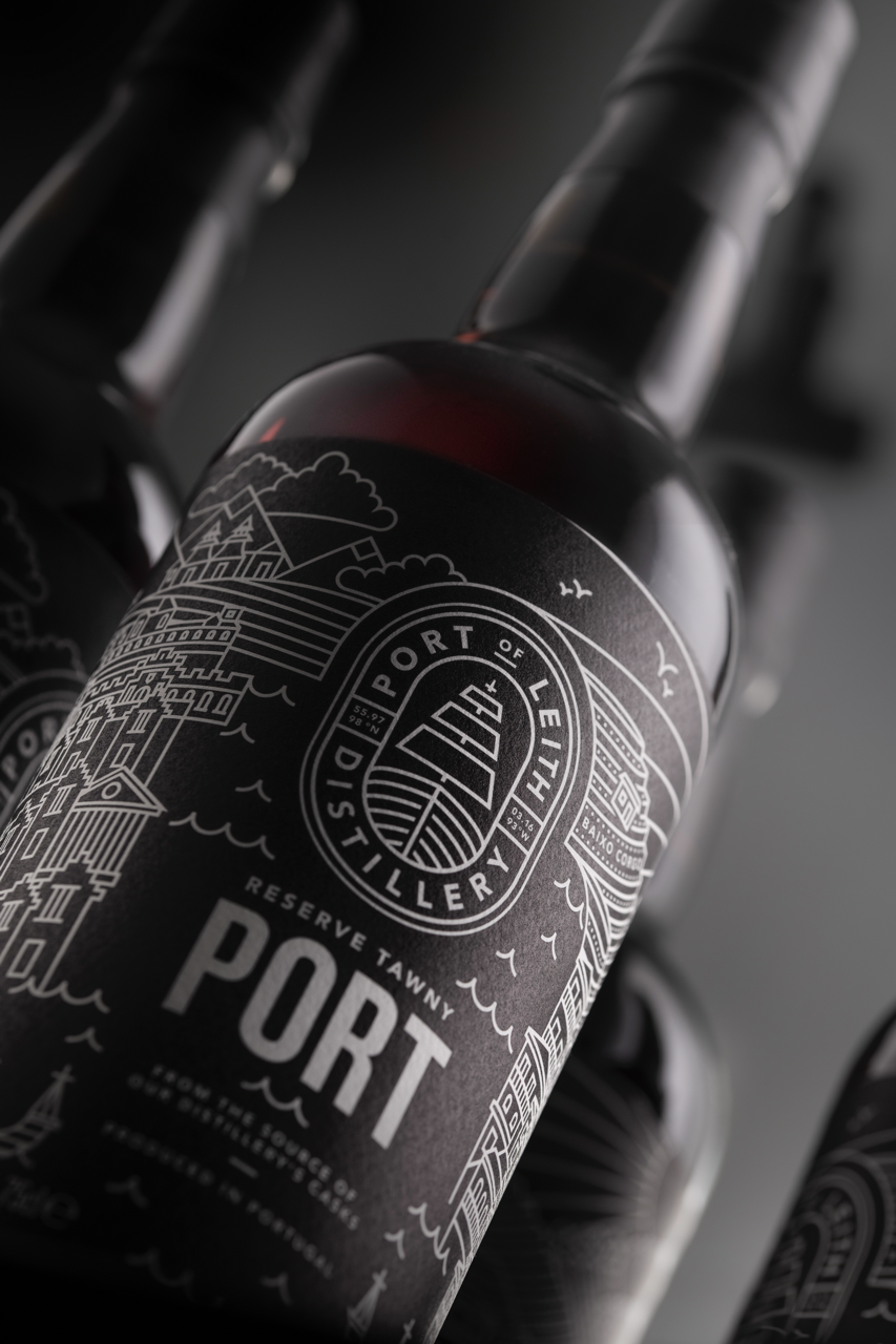
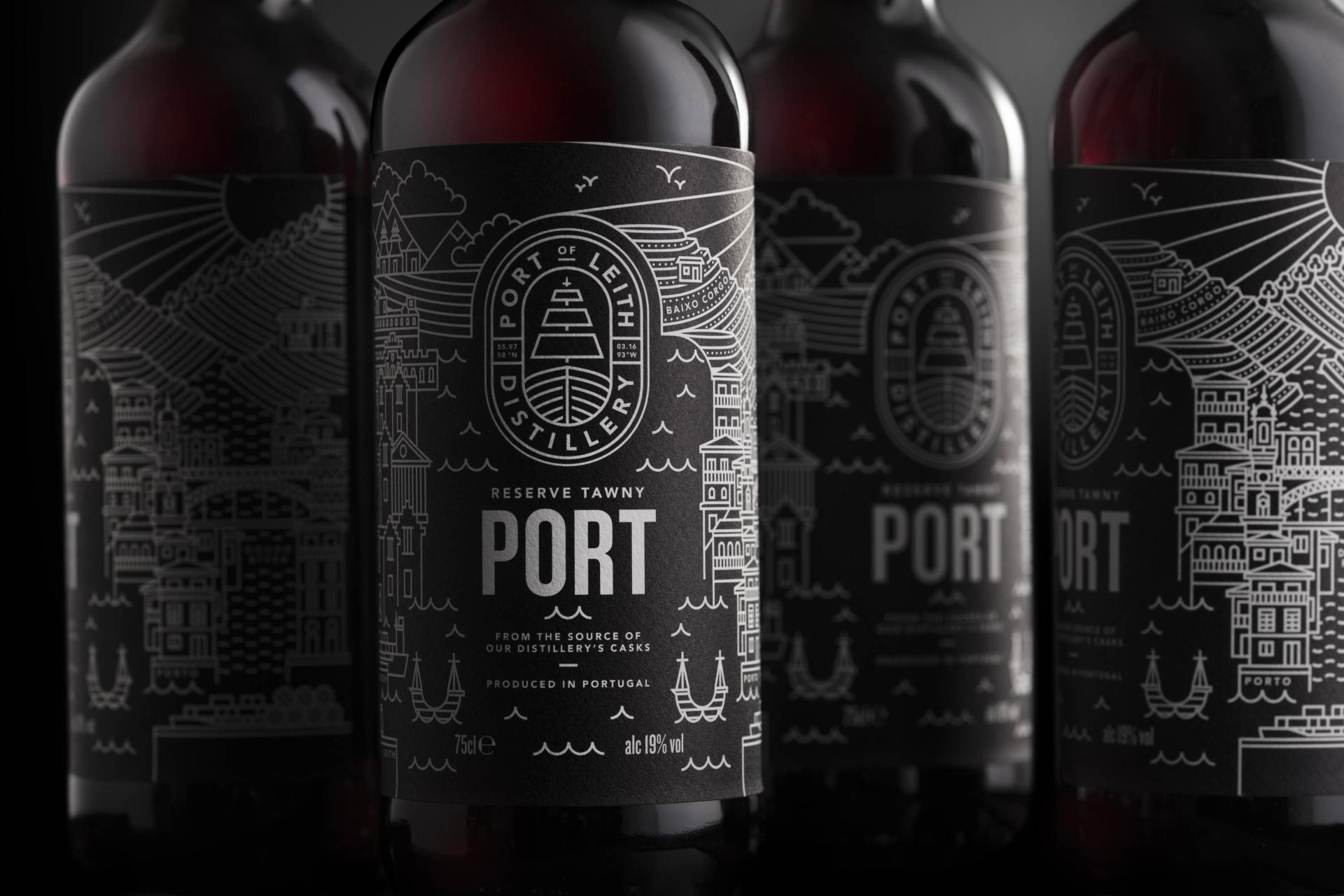
For the newest release in the brand’s portfolio, a Duoro Valley Port, we again employed the brand’s illustrative storytelling language. The target audience was the same as the Sherry, and this strategy provides consumer recognition and awareness of the portfolio range.
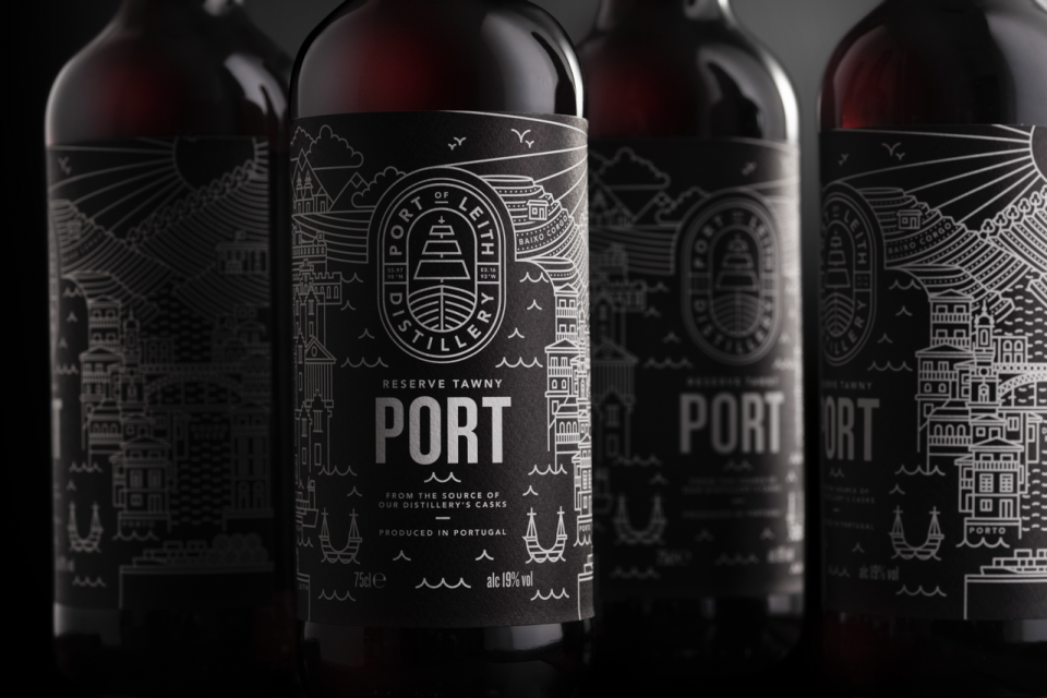
Reversing the black and white colour pallet creates a striking impact in retail environments. And for more customer engagement we’ve tailored the illustration on the right-hand side, to feature the Duoro Valley and Porto.
Port of Leith Sherry was a run away launch success, Lind & Lime Gin tripled production and sales in under 2 years, and Port sold out within a matter of weeks.
With the brand identity set and the first product releases setting the standard for quality and innovation, Port of Leith Distillery has already achieved a remarkable following. These advocates are now eagerly awaiting the first whisky release.